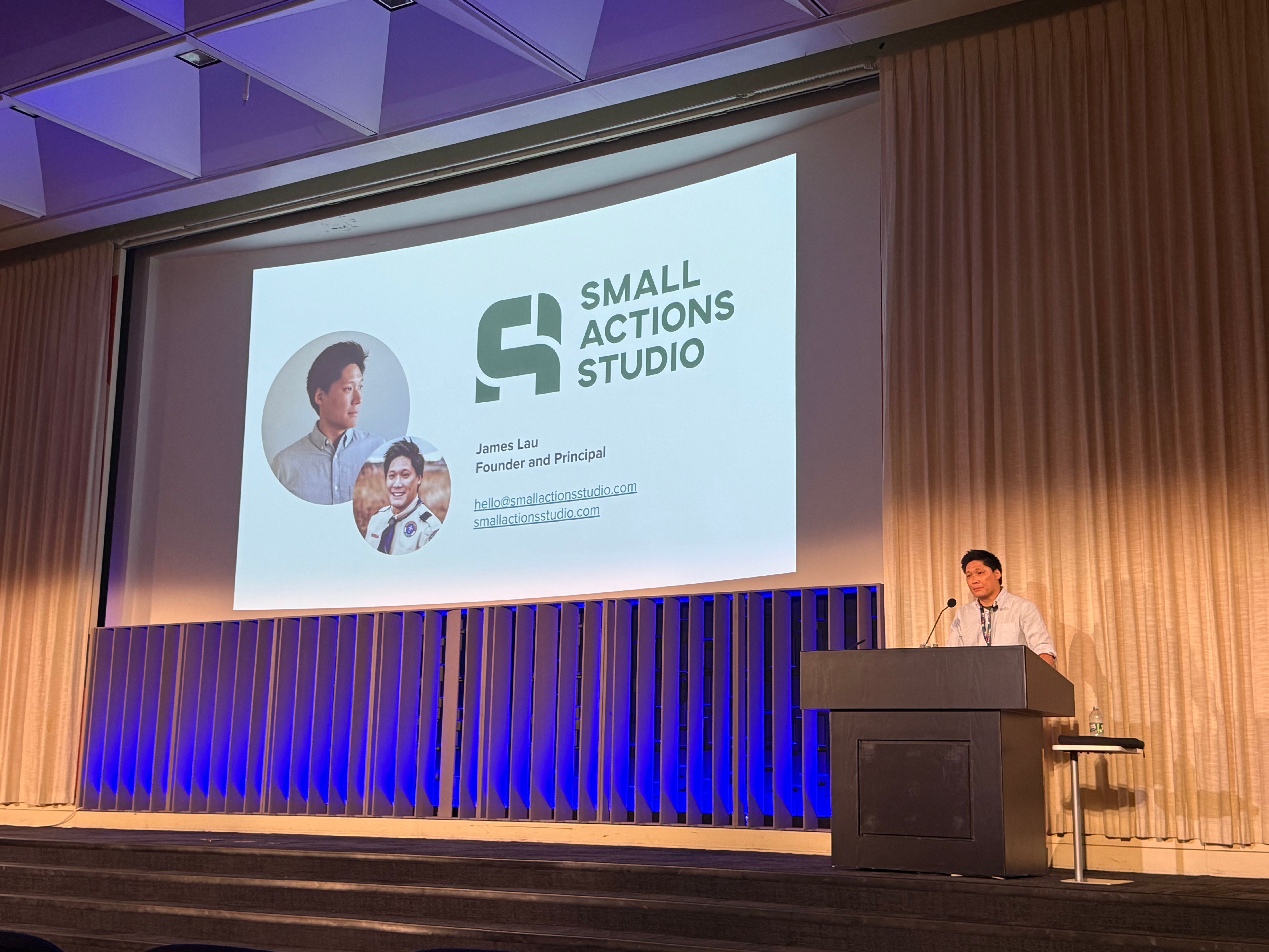
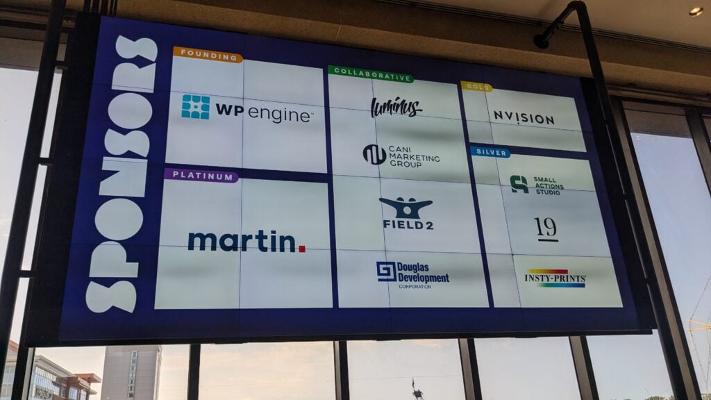
ColorCode held their second annual conference in Buffalo, NY. Small Actions Studio was selected to be a sponsor and speaker for this years event.
We’ll go over some of the highlights from this event.
Breath of Fresh Air
We’ve attended a good number of WordPress conferences over the years. When we heard that the organizers of WordCamp Buffalo started their own tech conference, we had to go check it out.
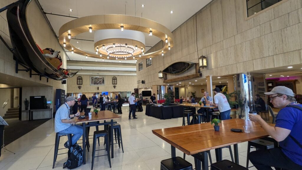
ColorCode: Buffalo was honestly a breath of fresh air. The new mix of attendees that showed up at this event definitely reflected the locals of Buffalo, NY more, but it also opened doors to curious business owners from various sectors who wanted to catch up on the latest tech news when it comes to online publishing.
We met with local design and development agencies, educators from local universities, nonprofit board members, social media marketing specialists, a videographer (drone pilot), and a food truck owner.
However, the elephant in the room when it came to talk topics was, artificial intelligence. Let’s face it, there is no way around this topic other than time. It’s on everyone’s mind lately. It has drastically changed the workforce landscape on multiple fronts.
This did not deter people from attending this event. If anything, it brought more people together. We all want to know what is happening to our jobs, how it can improve our business, and how it will reshape business models over time.
Three Conference Tracks
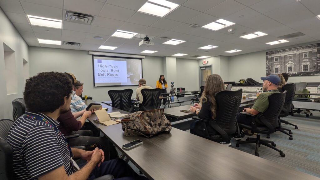
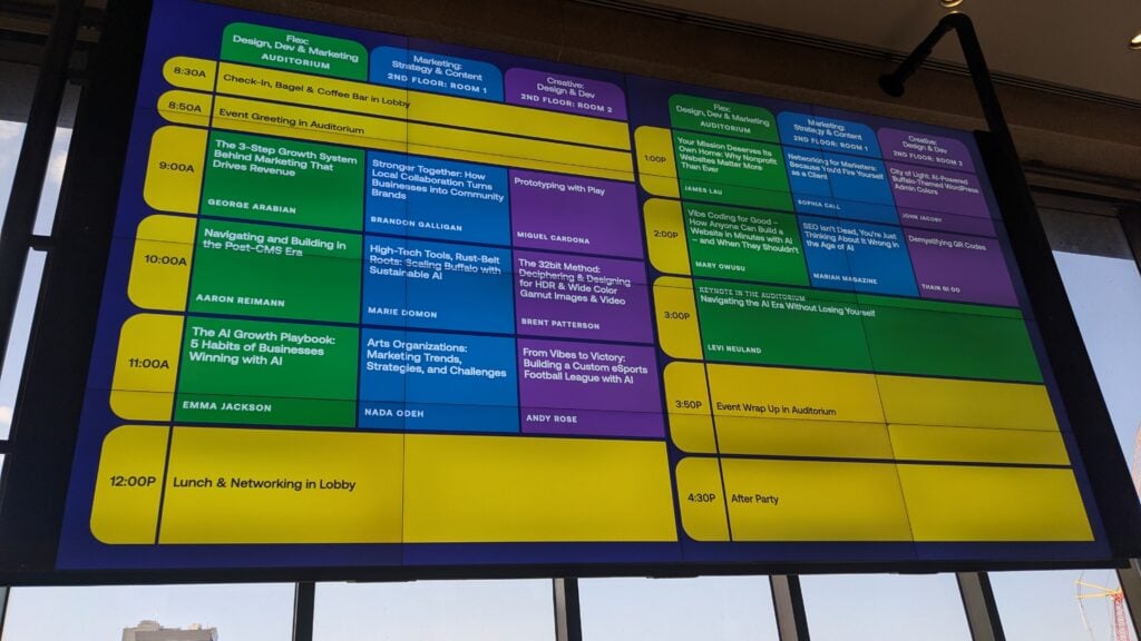
The conference was split into three tracks—Flex, Marketing, and Creative—each with its own specific topics on industry changes and personal stories. We gave our presentation after lunch in the flex track.
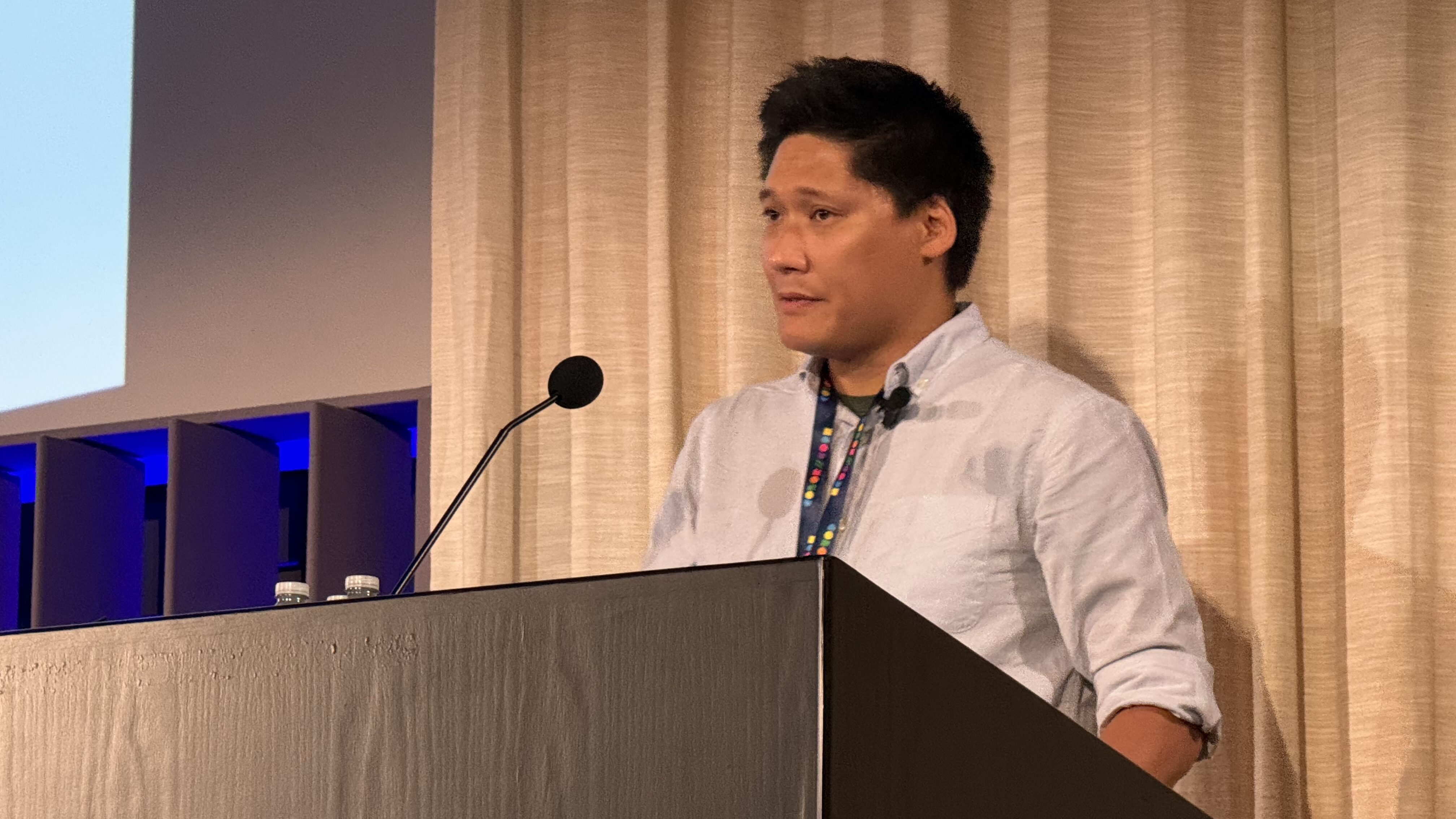
Since we’re an agency that specifically works with the nonprofit sector, our talk was called, “Your Mission Deserves Its Own Home: Why Nonprofit Websites Matter More Than Ever.” We did add one story about AI in the mix, but the bigger takeaway was that you still need a human in the loop to tell a story, to explain the impact when a nonprofit organization makes a lasting change for the community.
Although the venue didn’t have an AV system to help record the talks, the ColorCode organizers had set up their GoPros to record the different tracks. We think this was a nice plus. For those who could not attend a particular track can still view the talks later.
A Conference Well Worth Your Time
From our perspective, ColorCode was more than just another tech conference about the web. It brought out the best and most vocal people from Buffalo to gather and to connect. Of course, there were folks like us who traveled from Boston to attend. Someone even traveled from Atlanta, Georgia!
This conference brought together industry leaders, business leaders, and organizational heads that wouldn’t otherwise meet. A tech conference doesn’t have to be massively expensive, nor does it need to have over a thousand attendees. What you need is a mix of good, thought-provoking people from various facets of the industry, sharing local and global ideas we can all take back. But at the end of the day, you want to make lasting connections with people who share the same ideals as you do.
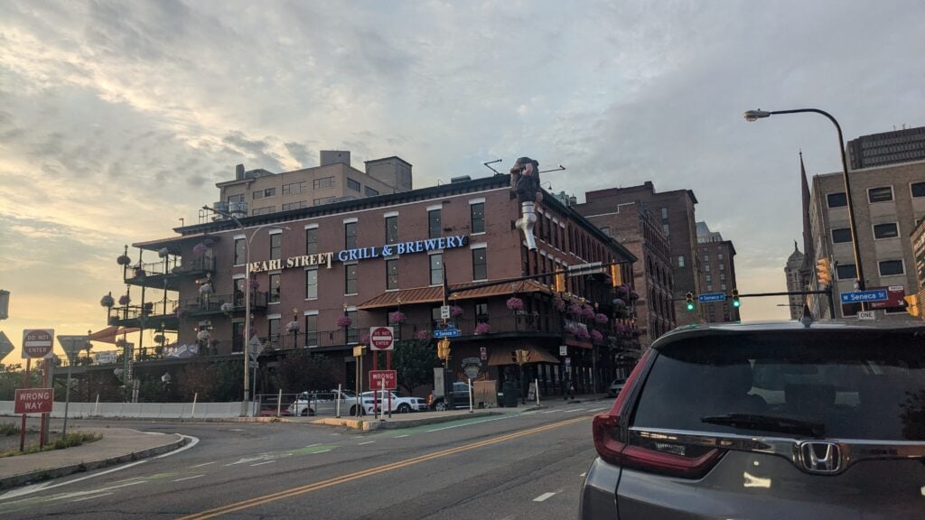
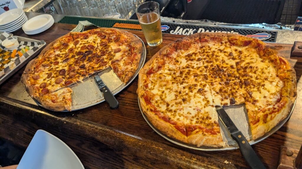
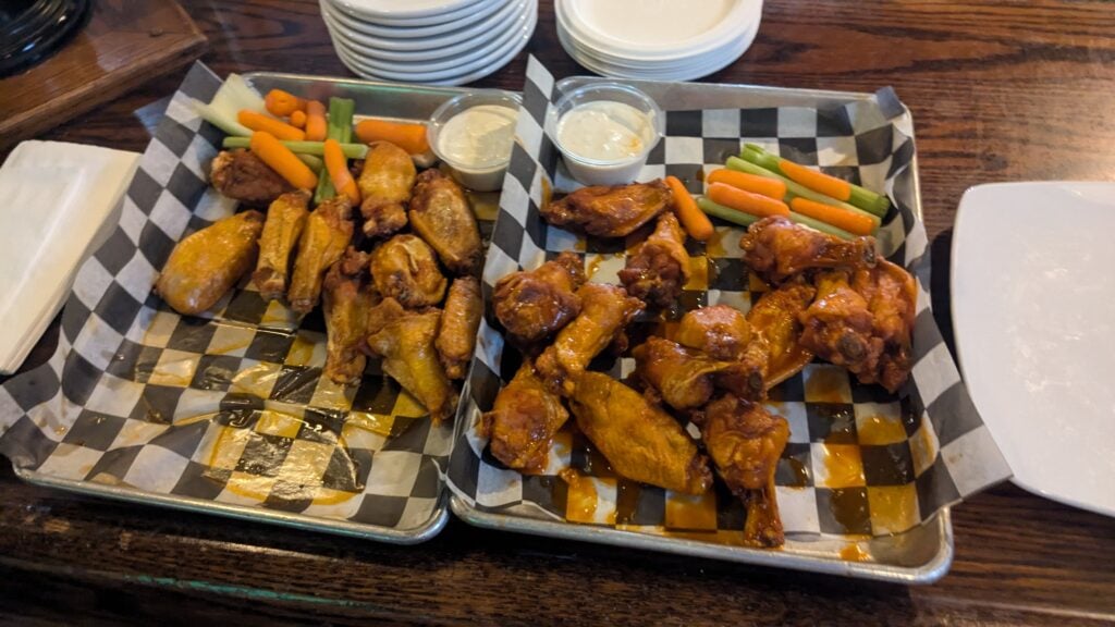
After the last talk, our event organizer held a raffle that was given out by HighLevel. We all then proceeded across the street to Pearl Street Grill and Brewery for some food and drinks.
This was generously provided by the organizers. Both speakers and attendees were welcome to join.
Most nonprofits produce their annual reports during the first quarter of the year while some organizations produce them around the fall, during government funding cycles. Because this is a typical box to check off on the to-do-list, nonprofit organizations forget that this piece of document is also a strategic asset when it comes to sharing with the public and potential donors.
In this article, we’ll go over the importance of an annual report. Why design matters, why the messaging matters, and why having a placement for the report on an organizations website is a critical marketing tool.
Annual Report: Outline
Much like the outline of a book or article, an annual report has a structure to follow. From a high level, an annual report design should contain at least four parts, and they are: history, mission and vision, financial health, and accomplishments from previous years. We call this civic design.
Mission and Vision
We’ll start of with a brief history about the organization. Building a base to planet a story or character. Why it was founded and what communities it is trying to serve. We’re building empathy and compassion for the organizations existence. Some organizations come from humble beginnings. Either from a death of an individual to the need to help out a family in need.
Continue from the history, we need to develop the organizations reason for existing, its mission. This is the guiding star that helps board members and volunteers understand its purpose, why people should be involved and continue to support and contribute to its cause.
If the mission represents the past, then the vision represents the future. What does the organization hope to achieve. What can the community benefit from the organizations efforts. Outcomes that can shape humanity for a better future. Either to prevent something from happening through community action or to raise awareness and fund a movement for generations.
Financial Health
A nonprofit entity is no different than a for-profit entity, the only difference is that the funds directly goes back to the growth of the organization. Funding programs, campaign events, and other marketing material initiatives. This is the heart of the document. This portion showcases proof to donors why their contributions matter.
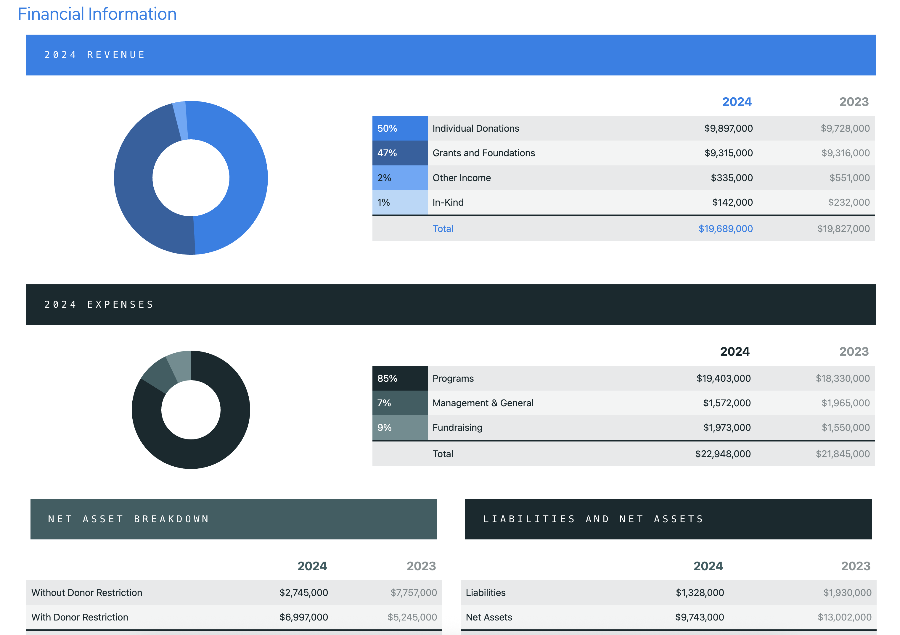
If an nonprofit has been around for while, the treasurer should have a collection of financial reports from previous years. A data-tablet that showcases fiscal growth of various programs that it supports. How well did the art classes perform? How much funding was required to support a monthly food drive event? What was the cost to host a golf tournament or annual summer fun event? There can also be charts to show the diversity in the population in with the organization resides. What the demography is made up of and how each ethnic group benefits from the organizations quarterly or yearly efforts.
Accomplishments
Every year a nonprofit organization will host various programs and fundraising events in hopes to raise awareness of their cause. Like most small organizations, the majority of the donations come from local supporters. The larger the organization, the more national the support.
This is the section where you get to celebrate the wins. Highlight the programs that made a measurable difference. For example, how many people were served, how many meals were distributed, or how many students completed a mentorship program. Statistics tell a story, and donors want to see that their contributions translated into real outcomes.
Accomplishments aren’t just about statistics, this is also the place to highlight the human side of the work involved. By adding a testimonial from a community member, a quote from a volunteer, or a brief story about someone whose life was changed by the organization can go a long way.
Illustrating the milestones in a way that helps questions the efforts. Did the organization reach a funding goal? Launch a new initiative? Expand into a new community? Earn a grant or recognition from a local institution? These are all worth calling out. because they signal growth.
Annual Report: Design
Now we have outlined on what goes in an annual report, let’s discuss design.
You want to keep the design consistent with your brand. This means: color, typography, images, and graphics. However, the design may very depending on the time of the year, or perhaps a theme. But don’t stray away too far.
We’ll go over three examples of great annual report designs that stays on-brand, but also sends a power message to their recipients on how their contributions to society helped shape communities aboard.
The Nature Conservancy
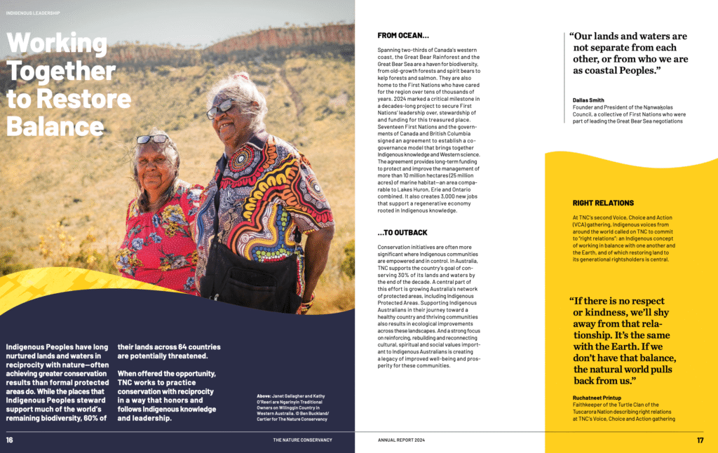
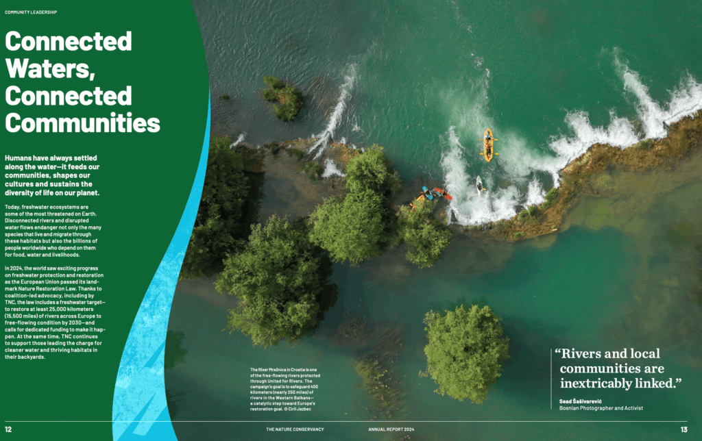
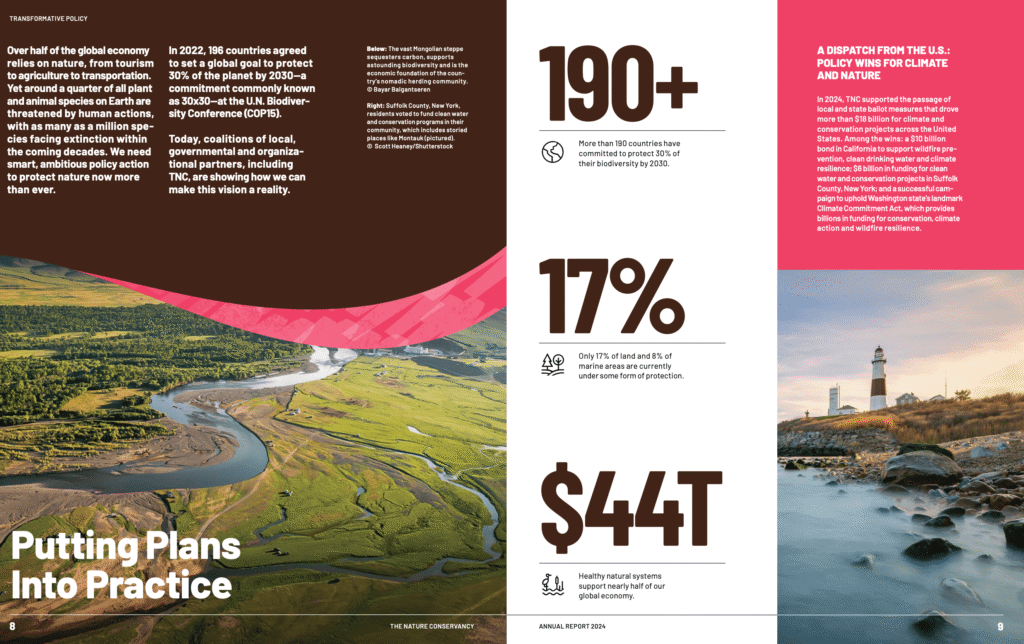
The Nature Conservancy is a worldwide environmental organization dedicated to safeguarding the natural ecosystems on land, freshwater, and ocean. It was founded in 1951 as a grassroots effort in the United States and since then they’ve grown into one of the largest conservation groups on the planet. They operate across more than 83 countries with over a thousand scientists and the support from more than a million members.
As you can see, there is a consistent design language with the patterns. The wavy accents (along with a distinct texture pattern within it) may not be part of their initial brand, but this design choice is specific for this annual report issue.
Light design touches like this helps the reader feel at ease.
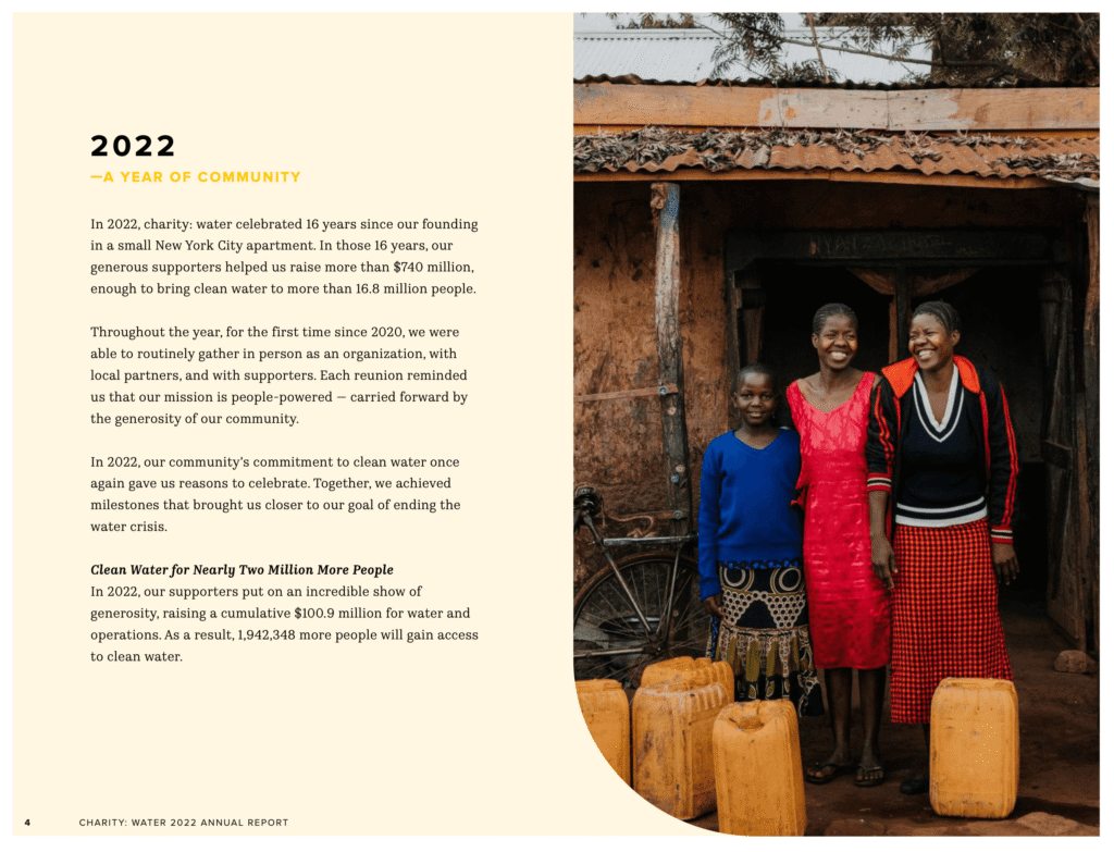
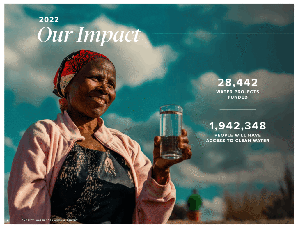
Charity: Water is a nonprofit organization focused on solving the global clean water crisis. With nearly 700 million people worldwide still lacking reliable access to safe drinking water, the organization funds water projects across 29 countries. By building infrastructure that unlocks better health, education, economic opportunity, and dignity, particularly for women and children in underserved communities.
What makes Charity: Water’s annual report stand out is the use of bold images to drive the message home. Showing you faces of people who are directly effected by the lack of clean water.
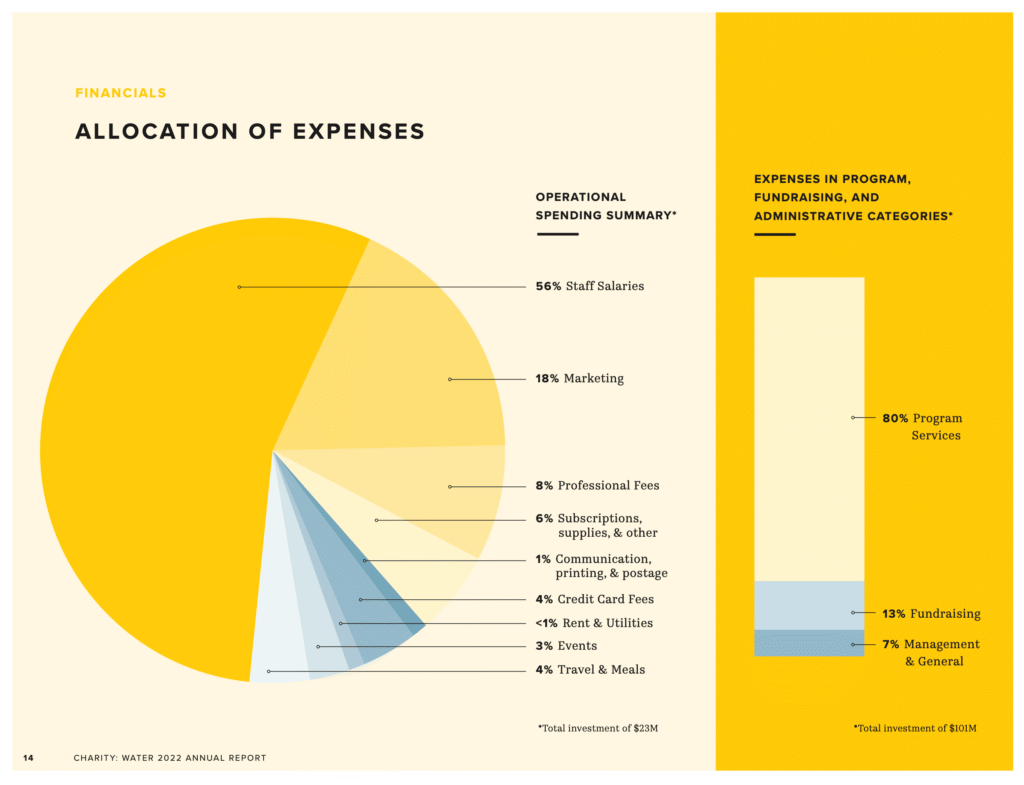
The last page example shows a pie chart that breaks down the operational spending for the nonprofit organization. This shows transparency for current and future donors who would like to help fund their initiatives.
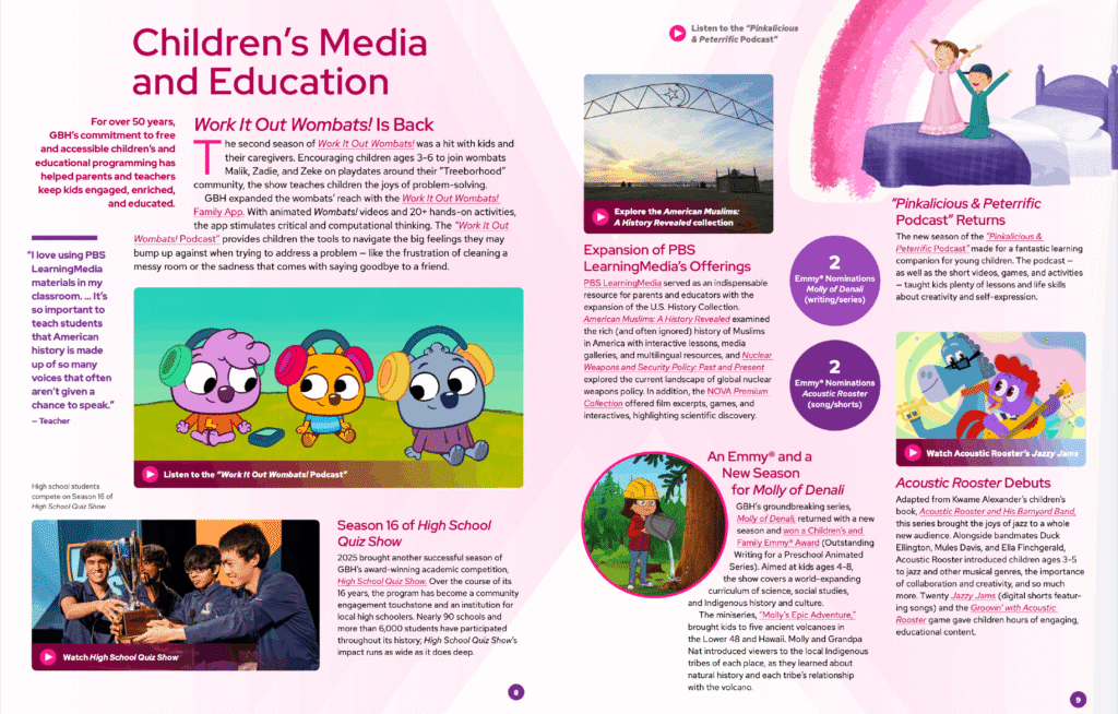
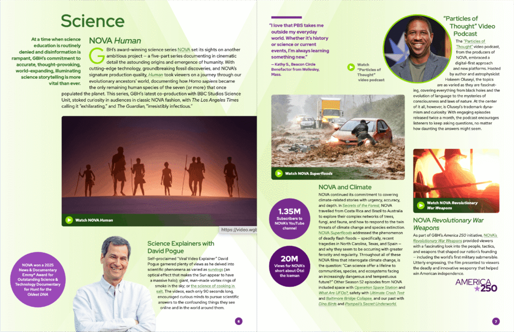
GBH (formerly WGBH) is the leading multi-platform public media producer in America, creating programming that spans national news, history, science, children’s education, and entertainment. Beyond television, the organization reaches communities through podcasts, radio stations, and digital platforms, thus keeping audiences informed and connected to the stories and events that shape their neighborhoods.
Much of what GBH produces is freely available to the public, a commitment made possible by the strong and sustained support of the communities it serves. A relationship between audience and institution is what makes this possible. People investing in content that informs, educates, and reflects their values back to them.
Being as big as GBH, the annual report could almost certainly go forever. At the same time, you want to maintain a good flow of positive and impactful statistics that highlight some of the successful wins from the previous year. The designer utilized bubbles that float throughout the document to help bring those important notes up.
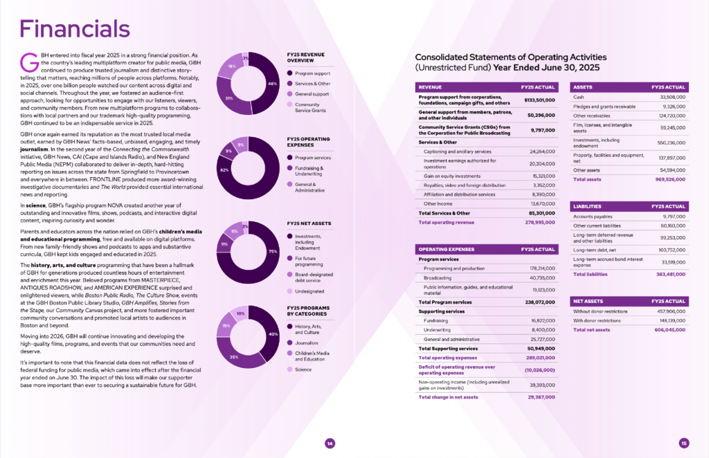
A strong example of financial transparency lives on pages 14 and 15 of their annual report. GBH breaks down their FY25 finances through four clear pie charts: revenue overview, operating expenses, net assets, and programs by category. Giving supporters an accessible visual snapshot of where funding comes from and how it is spent. Page 15 goes further with consolidated statements detailing revenue, expenses, assets, and liabilities down to the line item, offering a deeper level of accountability for donors and stakeholders who want the full picture.
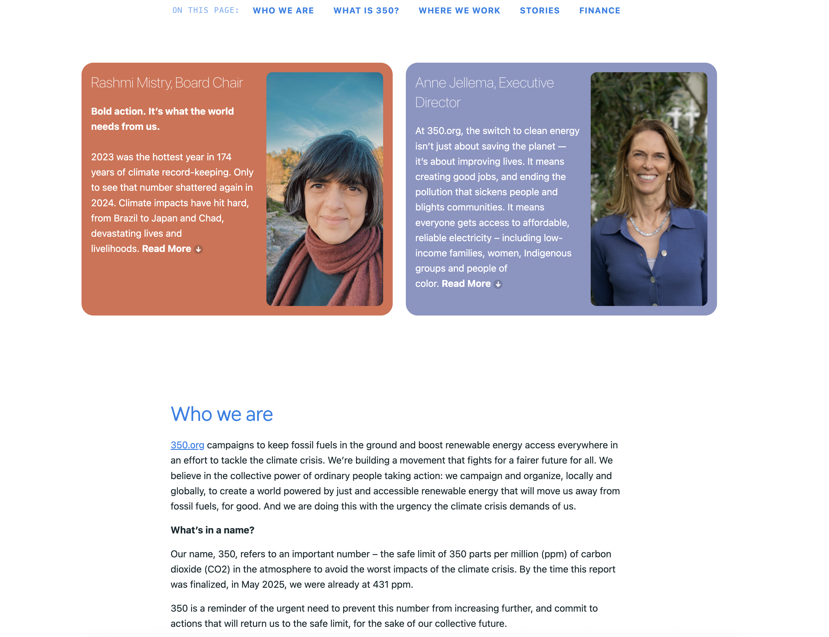
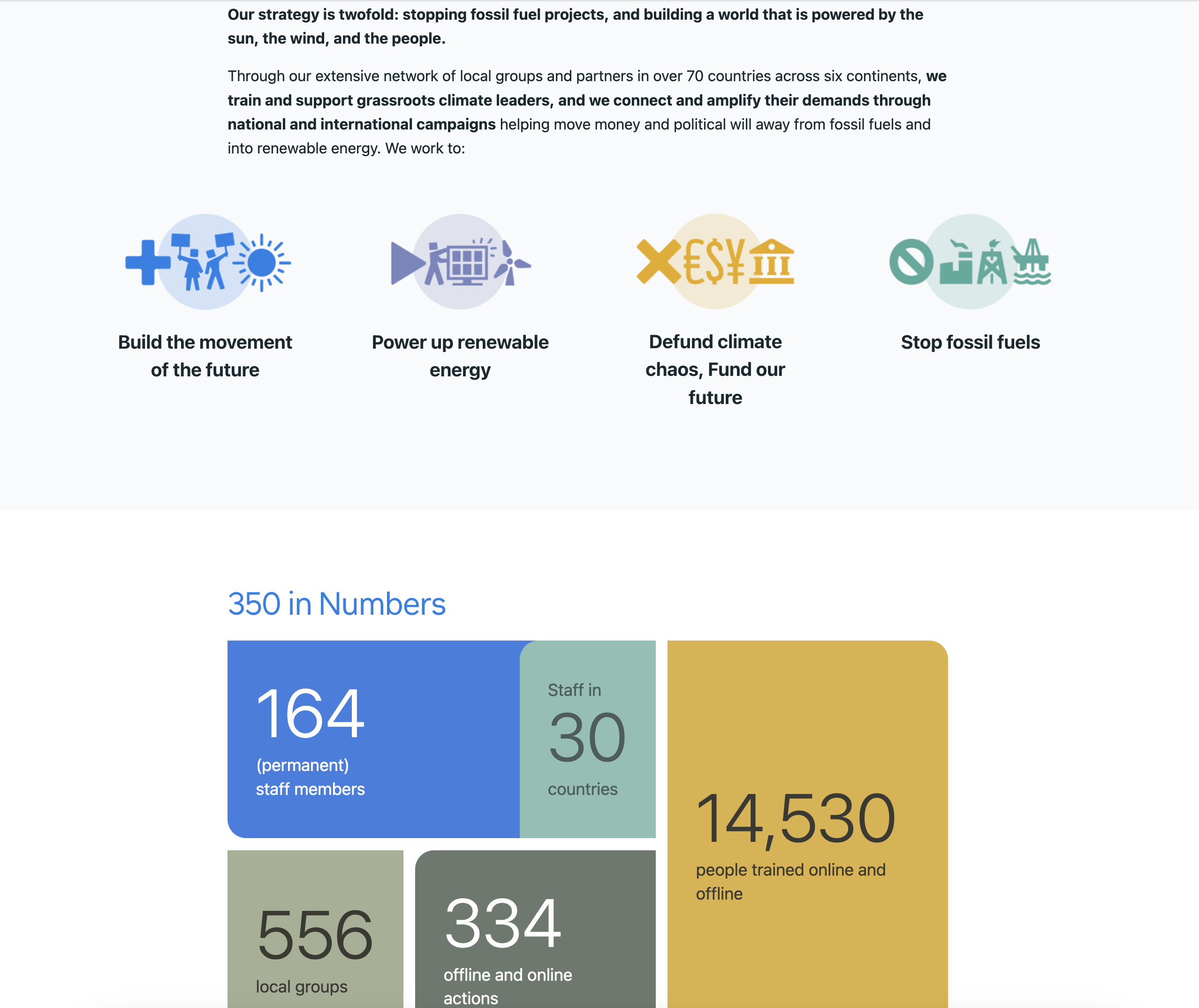
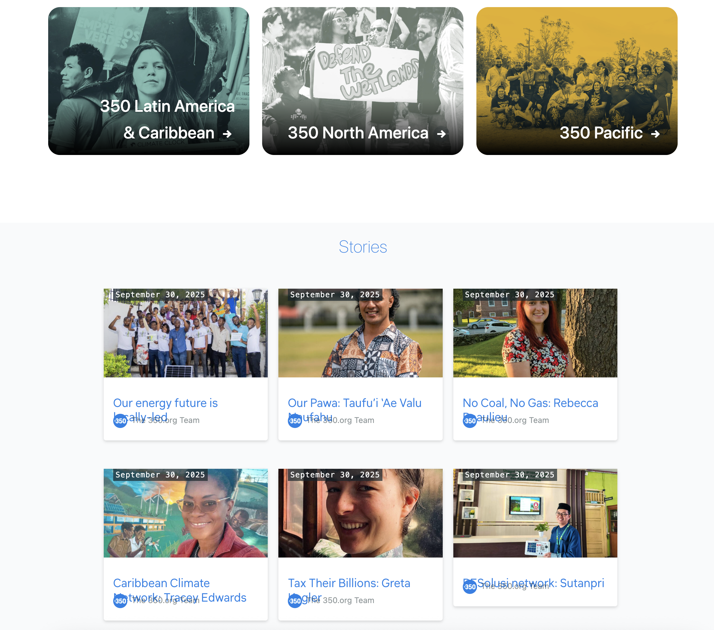
Having gone through the outline and design of an annual report, you’re probably wondering, where do the documents reside? As a nonprofit organization, you should provide easy access to the documents publicly. An example of a good display of annual reports on website is from 350.org. Under their subpage “annual-report” they link you to their latest report with subsections breaking down into: Who we are, What is 350, Where we work, Stories, and Finance.
This structure provides a nice overview of the organization mission and vision, their history, notable stories that showcases the impact that they’ve made, and the finances spend into order to achieve them. Before you hit the footer of the website, they also link to previous annual report pages and downloadable documents that you can gain access too.
Conclusion
Hopefully this article gives you a better understanding of why annual reports matter. This isn’t just another item on a to-do list. The design matters. Financial transparency matters. Showing the real impact your organization has made in the community matters. Treat this document as one of your organization’s most valuable presentation tools.
Interested in Designing Your Annual Report?
Your community deserves to understand your work. If your nonprofit’s isn’t reaching the people you serve—whether due to language barriers, outdated design, or unclear messaging—let’s talk about closing that gap.
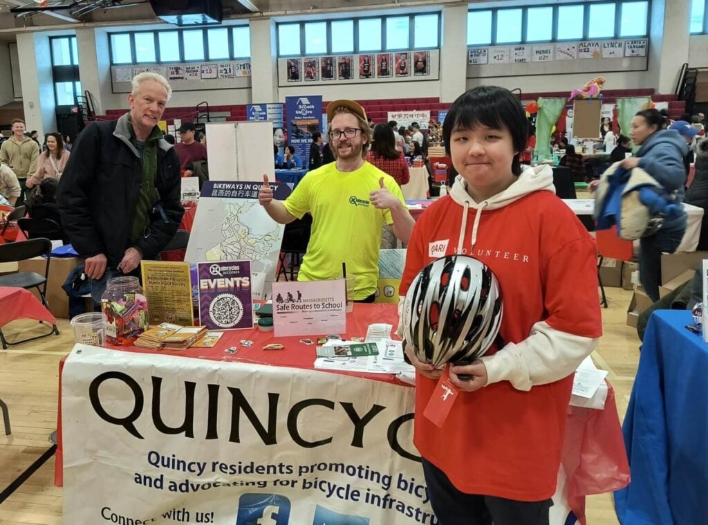
I first met Quincycles during the Lunar New Year Festival in 2024, held in Quincy, Massachusetts. They had a booth with a few flyers, pamphlets, and bicycling safety instructions, along with a giant foam core board with a map of Quincy. What was on this map, intrigued me the most. They provided pins for you to tag locations on the map, where you think bicycling lanes should be improved or added, and what route felt the most dangerous for cars, cyclists, and pedestrians alike.
I volunteered to add my o-PIN-ion (dad joke), and tag locations I felt were the worst and were in dire need of change.
After pining up my tags, I asked a member of the advocacy group how they got involved with the Lunar New Year Festival. Their table didn’t have anything written in Chinese or any other Asian ethnicities. They told me that they are trying to helping spread the word about bicycling safety, cycling infrastructure improvements in the city by engaging with the populous at cultural events.
The Data
The last known report of a traffic crash incident that involved a cyclist was back in 2023. An 86-year-old man of Asian descent died from a traffic injury. The community was shocked by yet another tragic loss. What’s more startling is that this isn’t the first time a cyclist who is Asian, has died from oncoming traffic.
This connected with me because, as an Asian American resident of Quincy, MA I wanted to know how the Asian community reacted to this incident and how they wish to voice their concerns. The last census data (2022) for Quincy, MA, 30% of the population is Asian.
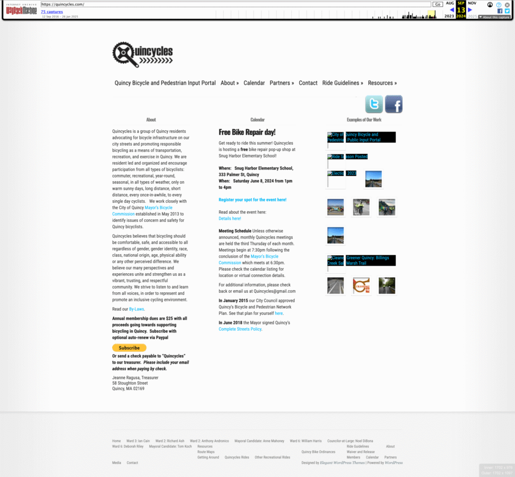
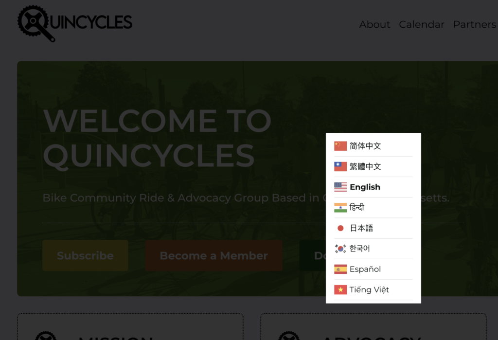
My next question was, “Do you guys have a website?” They said they did, but when I went home to take a look at their website, it was vastly outdated! You can view their old website on the Wayback Machine. What’s worst was that it lacked a multilingual toggle to better serve the local Asian American community.
Oh no, this will not stand!
Our Mission
While I was busy working during the summer and fall of 2024, I kept thinking about Quincycles and how the lack of a proper website would hinder the various communities within the city and their mission. I decided to reach out to Quincycles and offer them my services, and what I could do to improve their digital presence.
My first task was to assess their current website infrastructure. The WordPress version wasn’t too far off from 6.0, but the theme was old. Unused plugins needed to be deleted, overhaul of the website’s design, a better donation portal, and most importantly a translation option for the whole site.
I reached out to Steve, president of the organization, and shared with him my recommendations. Steve later spoke with his board members to have them weight in on what they felt needed to be improved before getting the okay for the project to start.
After a few weeks had passed, I drafted a proposal and gave them a copy of my Master Service Agreement document. A couple of weeks later, documents were signed and I was given the green light to begin the project!
Gathering Information
What needed to be done first was the infrastructure from the hosting side. The client had somehow tied two domains, a .com and .org, to GoDaddy, but was also paying for domain and web hosting at Ionos. They were paying more than they should for services they did not need.
For the domain, the free URL was originally obtained through GoDaddy and needed to be fully transferred over to Ionos. We would then have to end the payments for .com on GoDaddy.
Next, I connected with a few good folks from Pressidium who offered a bit of a discount for my client. This would further save the nonprofit a bit more money each month.
After the internal infrastructure was checked, I proceeded with exporting the database and the old website with WP Migrate DB Pro and ran a local instance with Local. This is the part where I got my hands dirty and inspected the plugins, assets, and content that made up the old website.
Although the client claimed they did not need any of the old content, I insisted that they needed to keep it in order to maintain previous links that would otherwise need to be redirected. Also, having valuable content on your site already would show that you’re actively engaged with the audience.
Starting From Scratch
Being a solopreneur means I need to manage multiple facets of the project at any given time. Two major roles make up the bulk of my work. One, being the designer and the other being the developer. Because I didn’t want to completely start from the ground up. I needed a base to prop up the work I was planning to do. Fortunately, a friend in the WordPress community, Emily Rapport, suggested I go with the Greyd Theme, as a boilerplate.
The Greyd Theme contained some nice prebuilt blocks and pattern elements out of the box. It also has a few additional styling controls that are not provided with plain WordPress. In addition, there are some accessibility guidelines baked into the theme that helps enforce proper rules.
Once the theme was selected, I needed to figure out what critical plugins were needed for the nonprofit organization. Since this is an advocacy group that targets the Asian population, a translation plugin was needed.
Initially, I offered Weglot as an option for the translation capabilities. But due to budget, we went with GTranslate. What sold me about this plugin is the unlimited translatable language options that I could activate on a single site. And this is on the free version!
The other plugin that I encouraged the nonprofit organization to adopt was GiveWP. Donation is a major component that allows a nonprofit to exist. You get funding from individual donors and other organizations either through a digital campaign or physical fundraising event.
When you drive traffic to your website, you need to make sure the donate button is as visible as possible. The next step is to retain the end-user and make them feel secure about giving donations. If you eject the end-user of your site to some other tab with some obscure widget, you may deter people from signing up or donating funds.
What I like about GiveWP is that they create a donation portal that stays on your website and it keeps the end-user engaged throughout the donation process. You can view your donation metrics/reports per donation form through WordPress’s admin dashboard interface.
Keep The Build Simple
This is an area that I know most designers struggle with. Having been a former designer, you can get stuck trying to figure out the proper UX design for a website. Designers block as some might call it. Luckily, the Greyd Theme has some pre built blocks and patterns for me to use. The major task was to retain the original content and get the the data up and running on the site.
Some minor custom patterns were created in order contain the existing data like dates, names, and titles of an article in a manner that reflected the based on there client’s requests.
There were also interactive Google Map routes that I felt they needed to keep as a nice history of their monthly rides. Sharing their community involvement from past events will help encourage future participation.
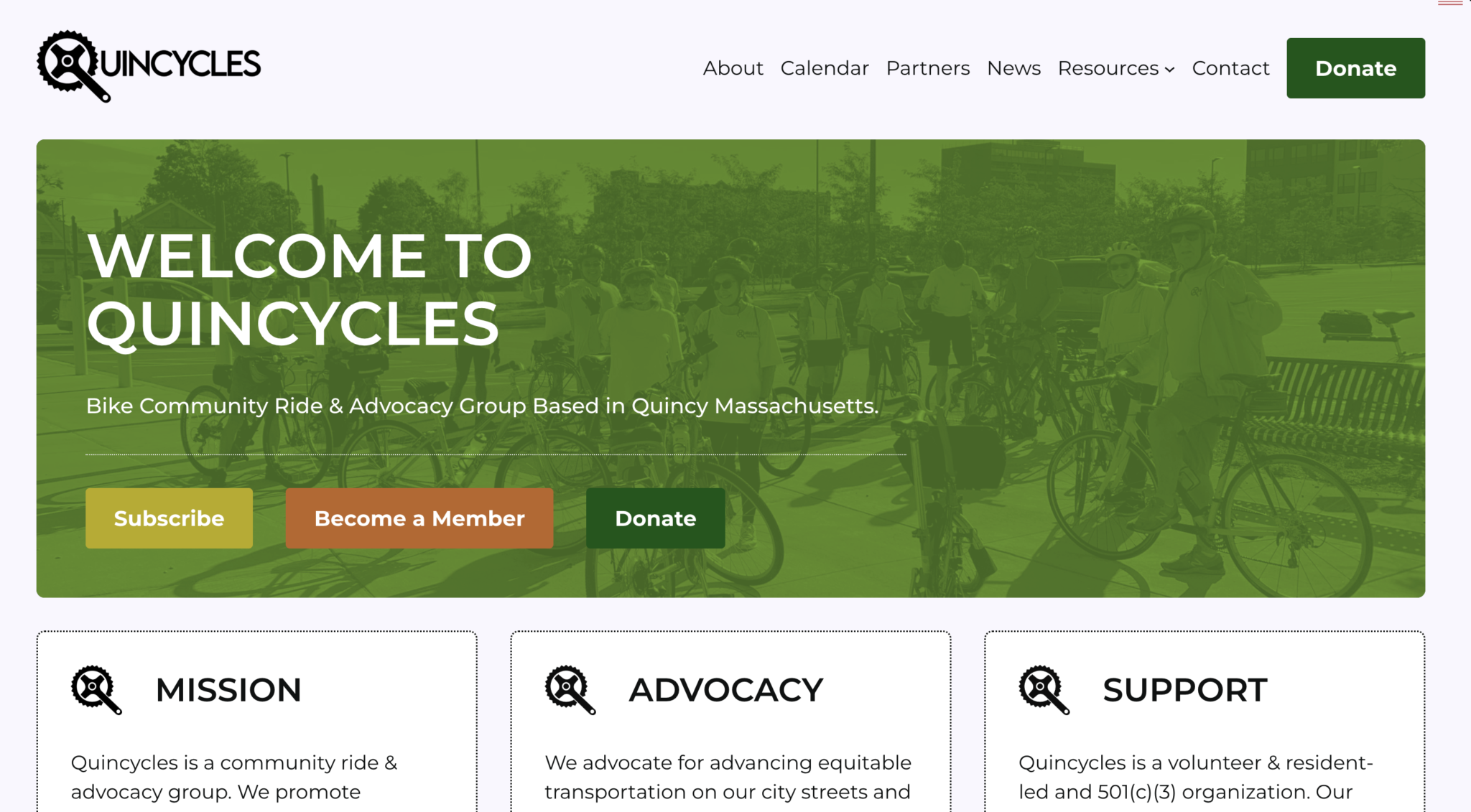
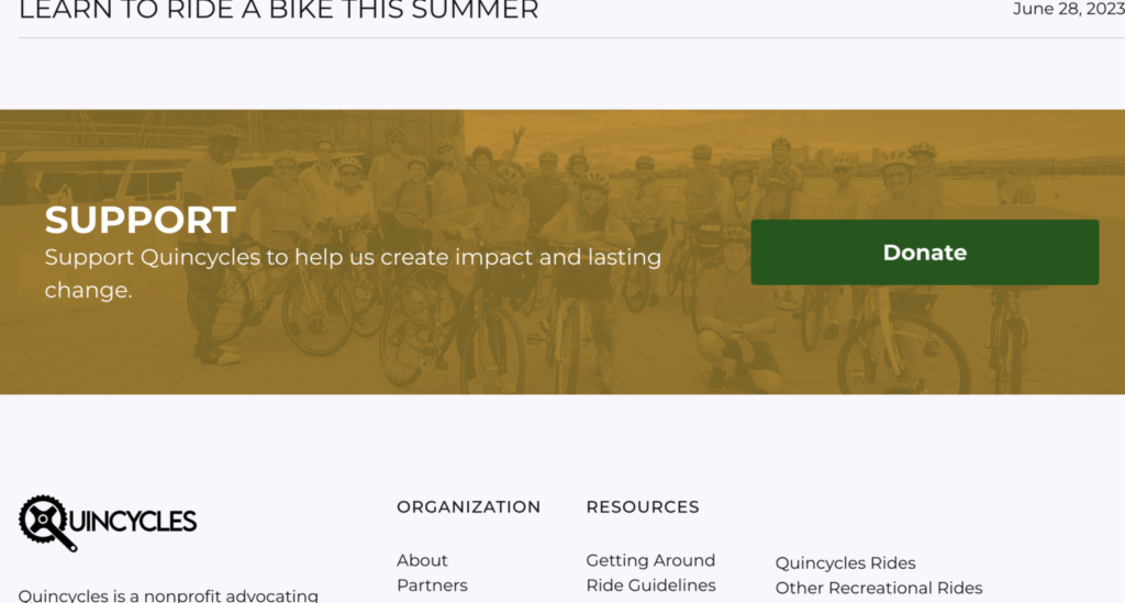
The new website was launched the day before Quincy’s Lunar New Year Festival (02-16-25). You can read more about Quincycles on their Facebook page.
Conclusion
I am honored to have had the opportunity to work with Quincycles on this website project journey. Helping to expand advocacy on better bicycling safety practices, change in bicycling policies, and to help out the Asian American community.
From a design and development perspective, I got to learn how to implementing proper WordPress site editor features, add responsive design, reinforce accessiblity features, and new plugin features for a better user experience.
If you are a nonprofit organization that wishes to work with me on revamping your digital media presence or to enhance the functionality, please feel free to contact me at any time!