Tag: branding

  • Nonprofit Annual Reports: An Underused Fundraising Tool

    Nonprofit Annual Reports: An Underused Fundraising Tool

    Most nonprofits produce their annual reports during the first quarter of the year while some organizations produce them around the fall, during government funding cycles. Because this is a typical box to check off on the to-do-list, nonprofit organizations forget that this piece of document is also a strategic asset when it comes to sharing with the public and potential donors.

    In this article, we’ll go over the importance of an annual report. Why design matters, why the messaging matters, and why having a placement for the report on an organizations website is a critical marketing tool.

    Annual Report: Outline

    Much like the outline of a book or article, an annual report has a structure to follow. From a high level, an annual report design should contain at least four parts, and they are: history, mission and vision, financial health, and accomplishments from previous years. We call this civic design.

    Mission and Vision

    We’ll start of with a brief history about the organization. Building a base to planet a story or character. Why it was founded and what communities it is trying to serve. We’re building empathy and compassion for the organizations existence. Some organizations come from humble beginnings. Either from a death of an individual to the need to help out a family in need.

    Continue from the history, we need to develop the organizations reason for existing, its mission. This is the guiding star that helps board members and volunteers understand its purpose, why people should be involved and continue to support and contribute to its cause.

    If the mission represents the past, then the vision represents the future. What does the organization hope to achieve. What can the community benefit from the organizations efforts. Outcomes that can shape humanity for a better future. Either to prevent something from happening through community action or to raise awareness and fund a movement for generations.

    Financial Health

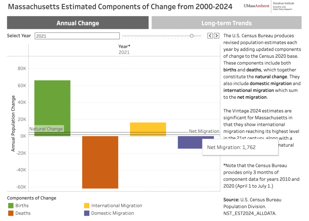
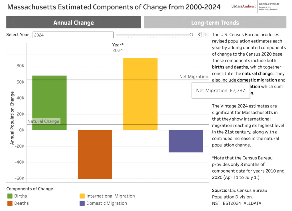
    A nonprofit entity is no different than a for-profit entity, the only difference is that the funds directly goes back to the growth of the organization. Funding programs, campaign events, and other marketing material initiatives. This is the heart of the document. This portion showcases proof to donors why their contributions matter.

    If an nonprofit has been around for while, the treasurer should have a collection of financial reports from previous years. A data-tablet that showcases fiscal growth of various programs that it supports. How well did the art classes perform? How much funding was required to support a monthly food drive event? What was the cost to host a golf tournament or annual summer fun event? There can also be charts to show the diversity in the population in with the organization resides. What the demography is made up of and how each ethnic group benefits from the organizations quarterly or yearly efforts.

    Accomplishments

    Every year a nonprofit organization will host various programs and fundraising events in hopes to raise awareness of their cause. Like most small organizations, the majority of the donations come from local supporters. The larger the organization, the more national the support.

    This is the section where you get to celebrate the wins. Highlight the programs that made a measurable difference. For example, how many people were served, how many meals were distributed, or how many students completed a mentorship program. Statistics tell a story, and donors want to see that their contributions translated into real outcomes.

    Accomplishments aren’t just about statistics, this is also the place to highlight the human side of the work involved. By adding a testimonial from a community member, a quote from a volunteer, or a brief story about someone whose life was changed by the organization can go a long way.

    Illustrating the milestones in a way that helps questions the efforts. Did the organization reach a funding goal? Launch a new initiative? Expand into a new community? Earn a grant or recognition from a local institution? These are all worth calling out. because they signal growth.

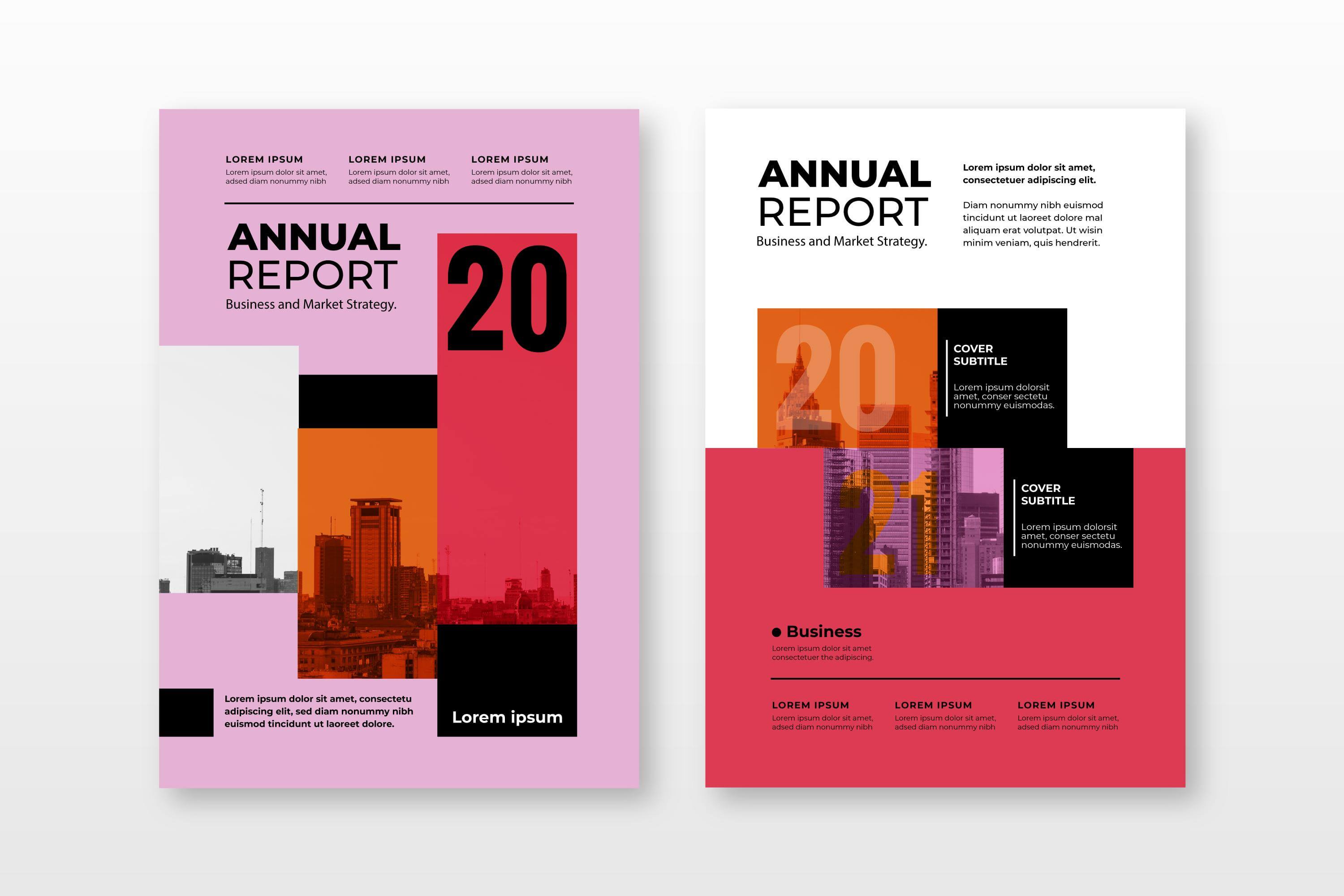
    Annual Report: Design

    Now we have outlined on what goes in an annual report, let’s discuss design.

    You want to keep the design consistent with your brand. This means: color, typography, images, and graphics. However, the design may very depending on the time of the year, or perhaps a theme. But don’t stray away too far.

    We’ll go over three examples of great annual report designs that stays on-brand, but also sends a power message to their recipients on how their contributions to society helped shape communities aboard.

    The Nature Conservancy

    The Nature Conservancy is a worldwide environmental organization dedicated to safeguarding the natural ecosystems on land, freshwater, and ocean. It was founded in 1951 as a grassroots effort in the United States and since then they’ve grown into one of the largest conservation groups on the planet. They operate across more than 83 countries with over a thousand scientists and the support from more than a million members.

    The Nature Conservancy 2024 annual report spread pages 16 and 17
    The Nature Conservancy 2024 annual report spread pages 12 and 13
    The Nature Conservancy 2024 annual report spread pages 8 and 9

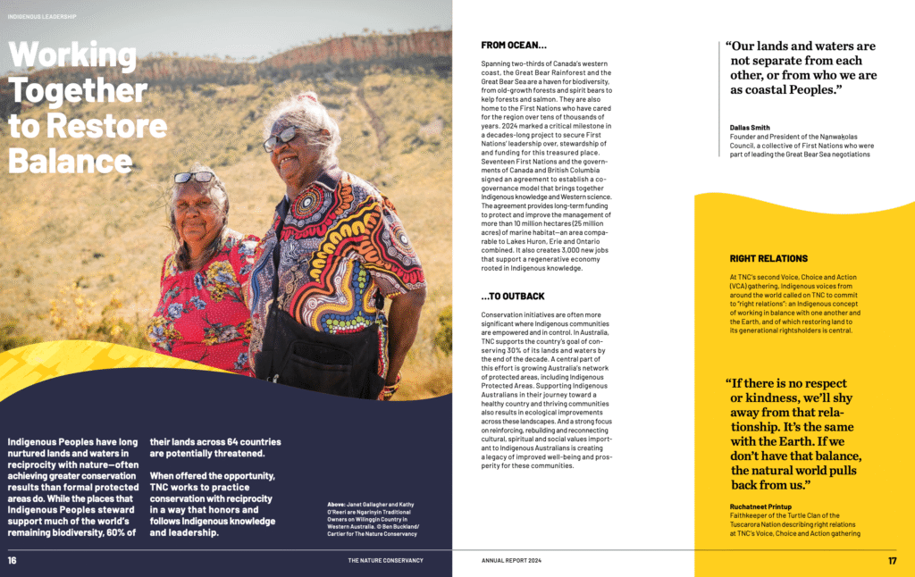
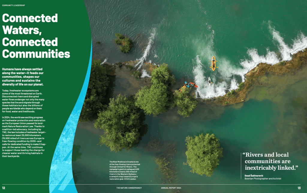
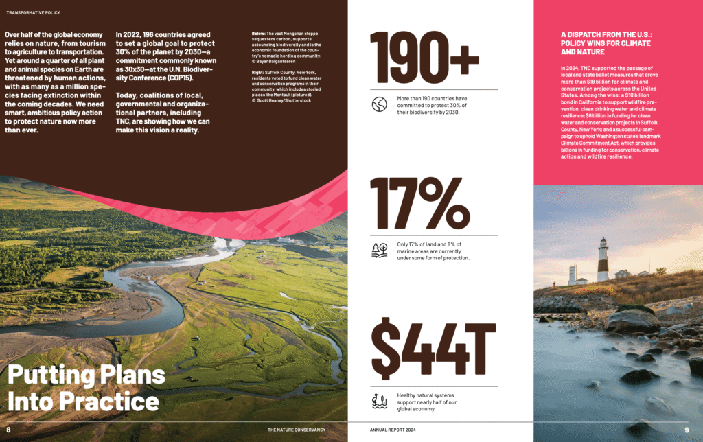
    As you can see, there is a consistent design language with the patterns. The wavy accents (along with a distinct texture pattern within it) may not be part of their initial brand, but this design choice is specific for this annual report issue.

    Light design touches like this helps the reader feel at ease.

    You can download a copy of their 2024 annual report.

    Charity: Water

    Charity: Water is a nonprofit organization focused on solving the global clean water crisis. With nearly 700 million people worldwide still lacking reliable access to safe drinking water, the organization funds water projects across 29 countries. By building infrastructure that unlocks better health, education, economic opportunity, and dignity, particularly for women and children in underserved communities.

    Charity Water 2022 annual report page 4
    Charity Water 2022 annual report page 6
    Charity Water 2022 annual report page 14

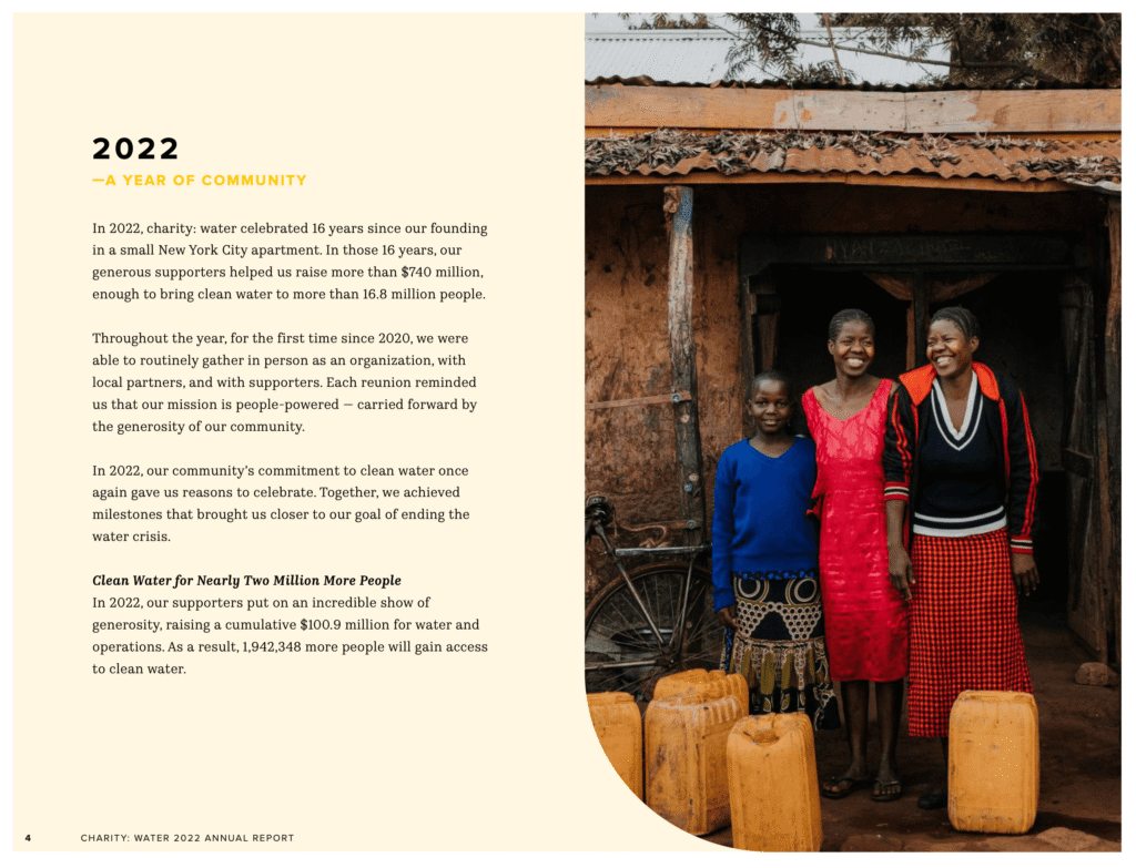
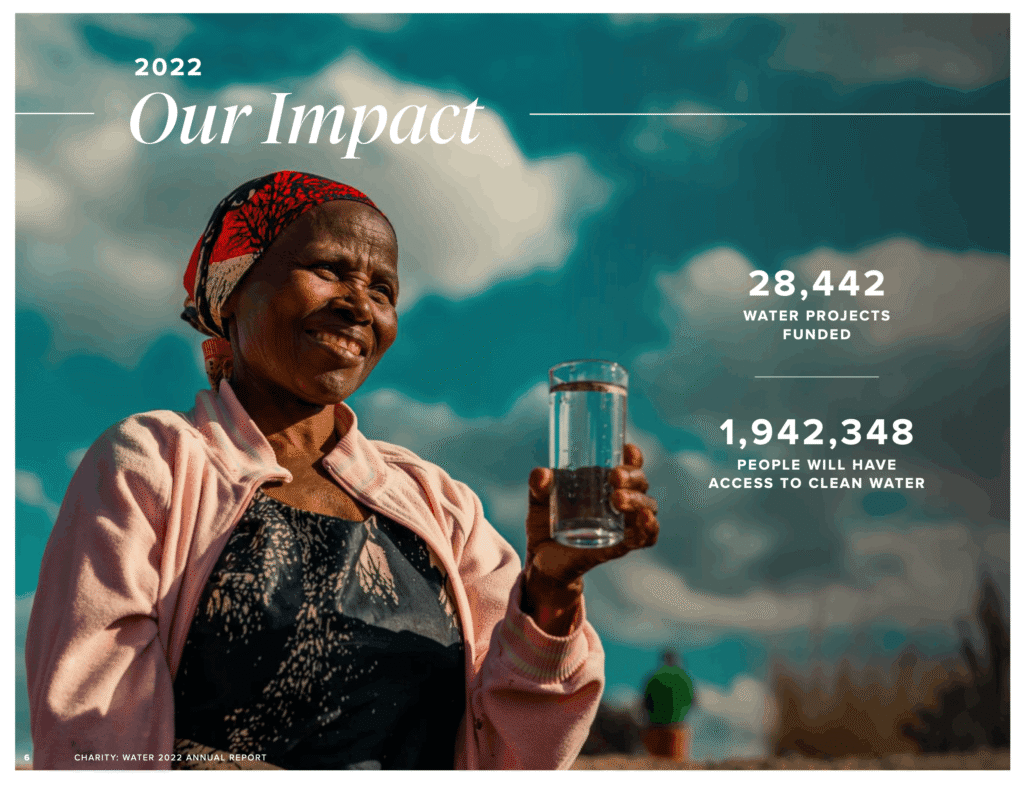
    What makes Charity: Water’s annual report stand out is the use of bold images to drive the message home. Showing you faces of people who are directly effected by the lack of clean water.

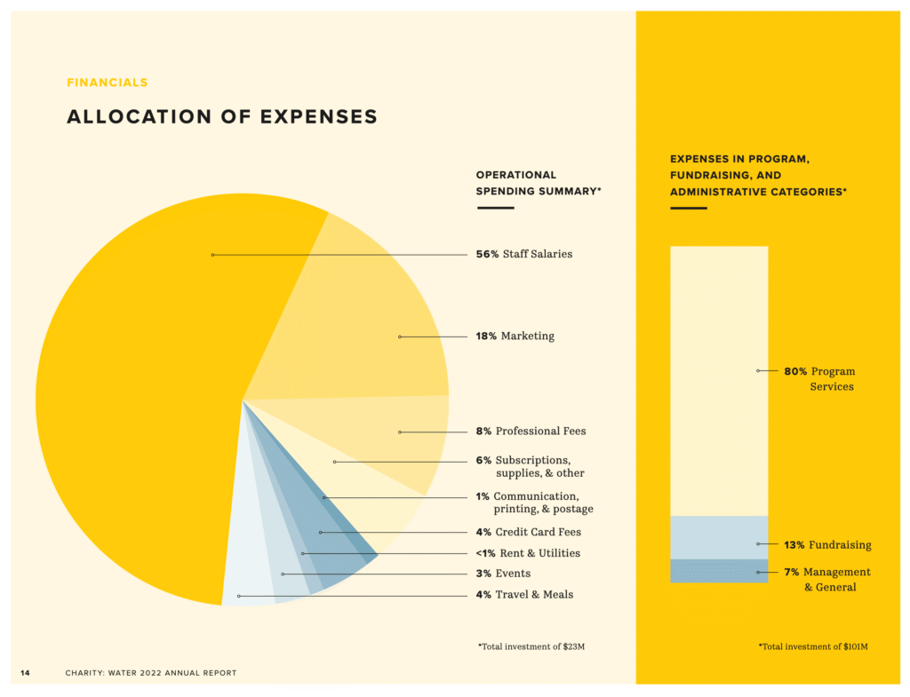
    The last page example shows a pie chart that breaks down the operational spending for the nonprofit organization. This shows transparency for current and future donors who would like to help fund their initiatives.

    You can download a copy of their 2022 annual report.

    GBH

    GBH (formerly WGBH) is the leading multi-platform public media producer in America, creating programming that spans national news, history, science, children’s education, and entertainment. Beyond television, the organization reaches communities through podcasts, radio stations, and digital platforms, thus keeping audiences informed and connected to the stories and events that shape their neighborhoods.

    Much of what GBH produces is freely available to the public, a commitment made possible by the strong and sustained support of the communities it serves. A relationship between audience and institution is what makes this possible. People investing in content that informs, educates, and reflects their values back to them.

    Being as big as GBH, the annual report could almost certainly go forever. At the same time, you want to maintain a good flow of positive and impactful statistics that highlight some of the successful wins from the previous year. The designer utilized bubbles that float throughout the document to help bring those important notes up.

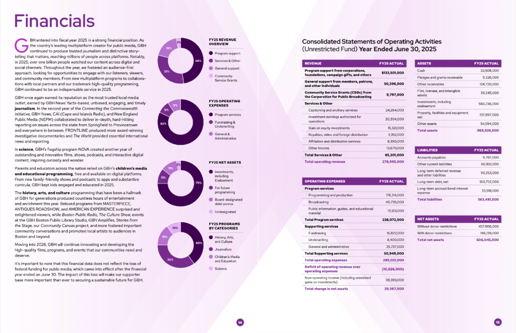
    A strong example of financial transparency lives on pages 14 and 15 of their annual report. GBH breaks down their FY25 finances through four clear pie charts: revenue overview, operating expenses, net assets, and programs by category. Giving supporters an accessible visual snapshot of where funding comes from and how it is spent. Page 15 goes further with consolidated statements detailing revenue, expenses, assets, and liabilities down to the line item, offering a deeper level of accountability for donors and stakeholders who want the full picture.

    You can download a copy of their 2026 annual report.

    Annual Report: Website Showcase Space

    Having gone through the outline and design of an annual report, you’re probably wondering, where do the documents reside? As a nonprofit organization, you should provide easy access to the documents publicly. An example of a good display of annual reports on website is from 350.org. Under their subpage “annual-report” they link you to their latest report with subsections breaking down into: Who we are, What is 350, Where we work, Stories, and Finance.

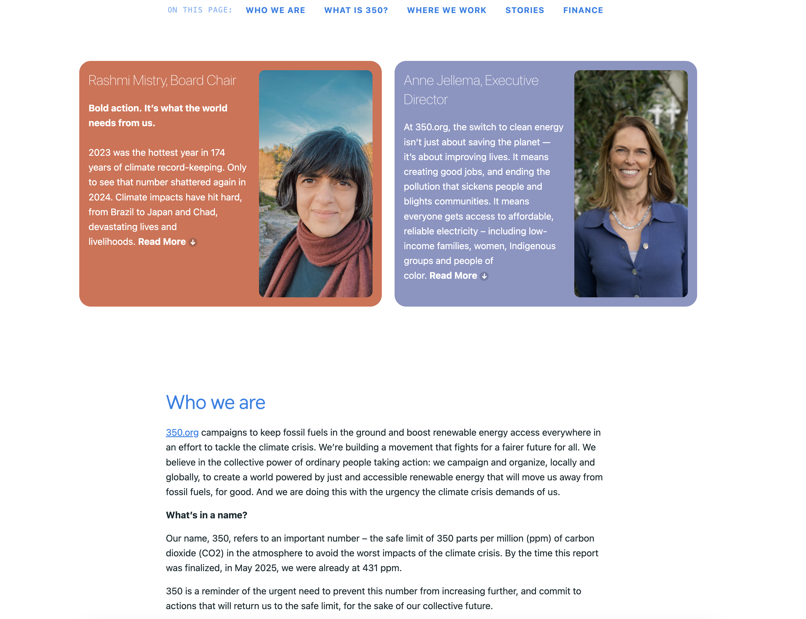
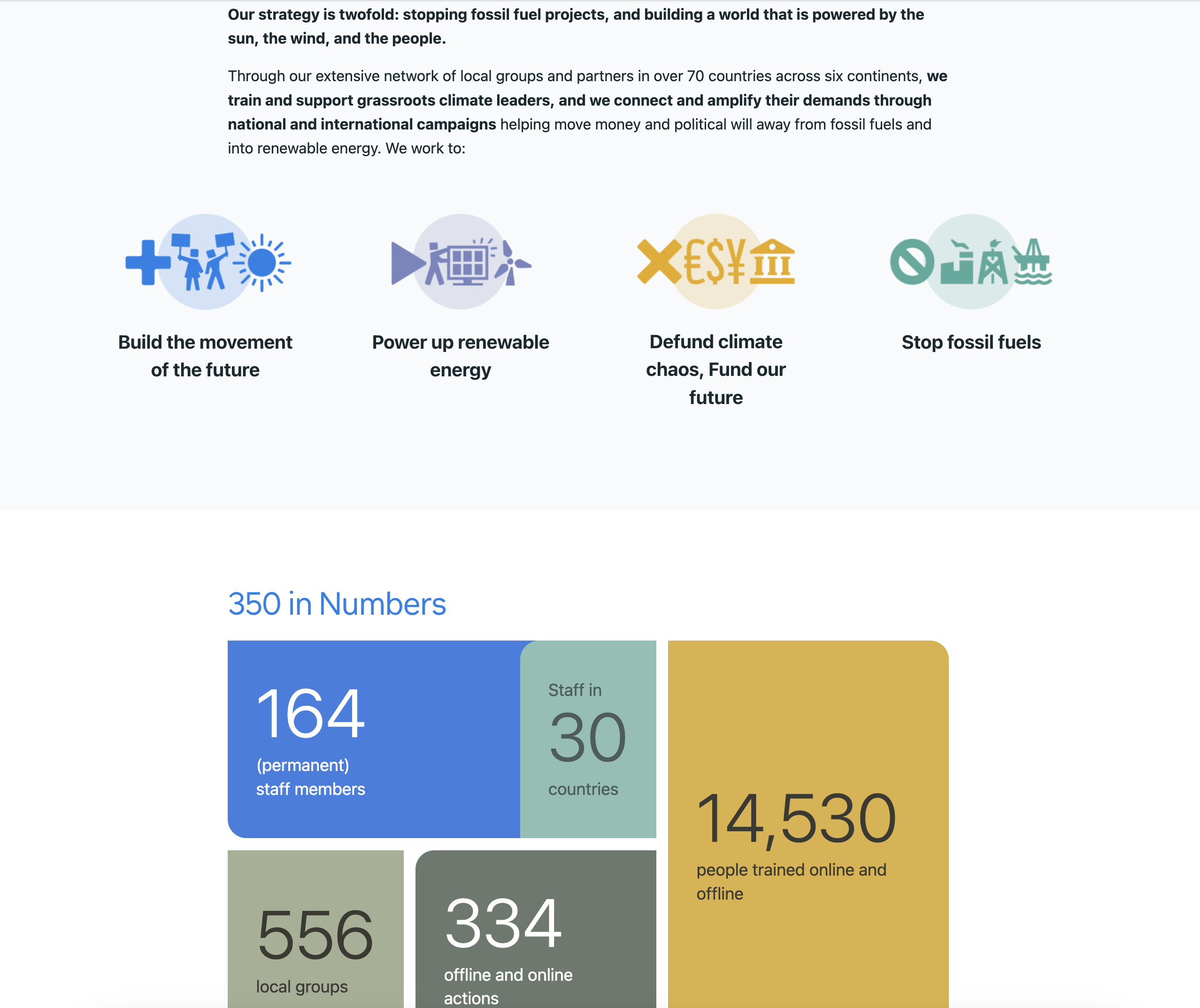
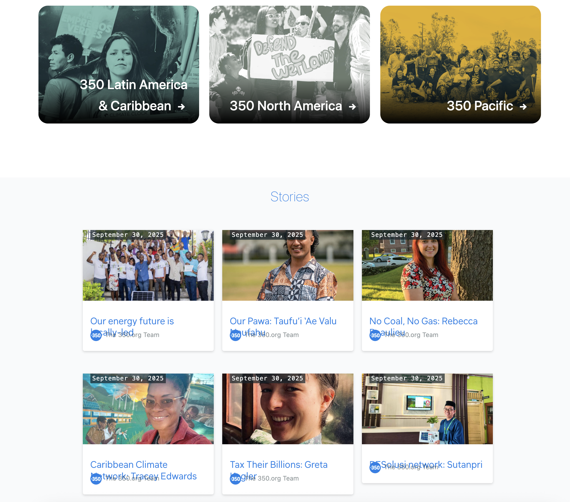
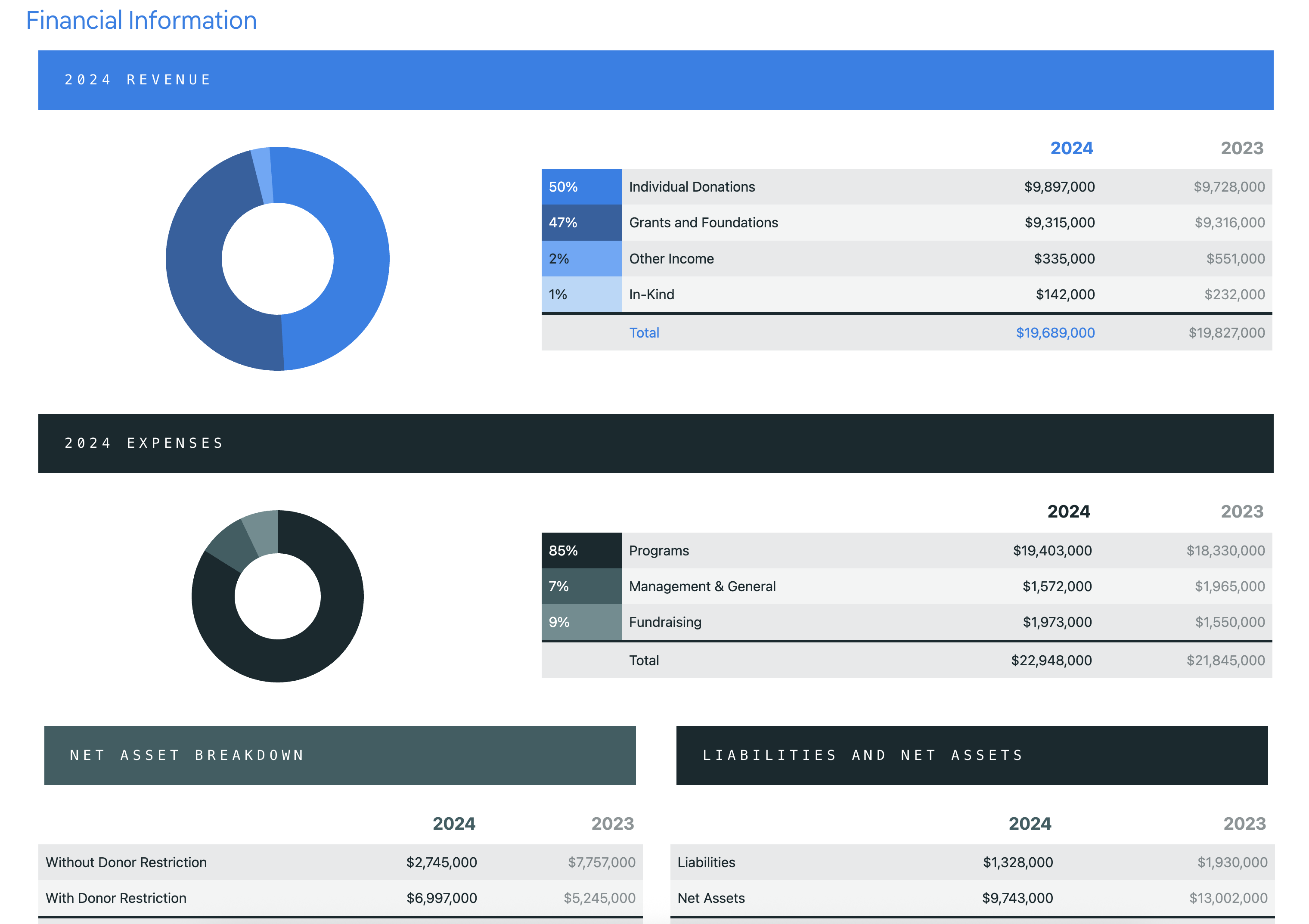
    This structure provides a nice overview of the organization mission and vision, their history, notable stories that showcases the impact that they’ve made, and the finances spend into order to achieve them. Before you hit the footer of the website, they also link to previous annual report pages and downloadable documents that you can gain access too.

    Conclusion

    Hopefully this article gives you a better understanding of why annual reports matter. This isn’t just another item on a to-do list. The design matters. Financial transparency matters. Showing the real impact your organization has made in the community matters. Treat this document as one of your organization’s most valuable presentation tools.

    Interested in Designing Your Annual Report?

    Your community deserves to understand your work. If your nonprofit’s isn’t reaching the people you serve—whether due to language barriers, outdated design, or unclear messaging—let’s talk about closing that gap.

    Reach out at hello@smallactionsstudio.com or write us a message through our contact page to start a conversation about your organization’s digital presence.

  • Language Toggle for Nonprofit Community Websites

    Language Toggle for Nonprofit Community Websites

    While attending the Massachusetts Nonprofit Network Excellence Awards, we noticed something important: many organizations serve communities where English isn’t the primary language. This got us thinking about how nonprofits can better reach the people they serve—not just donors, but the community members who benefit from their programs and can’t easily access information in English

    If your organization serves primarily non-English-speaking communities, how can you effectively communicate your mission and impact through your website?

    Why Language Toggle Matters for Nonprofit Mission Alignment

    Your nonprofit’s mission exists to serve a specific community. But here’s the uncomfortable truth: if that community can’t understand your website, your mission remains unfulfilled—no matter how thoughtful your programs are.

    Many nonprofits experience mission drift without realizing it. You design programs, create impact, and measure outcomes—all in English. Meanwhile, the very people you’re trying to serve are navigating your website in confusion, missing critical information about eligibility, deadlines, or how to access help. This isn’t just a communication problem; it’s an accountability problem. How can you authentically measure impact when a significant portion of your beneficiary community is effectively invisible in your data?

    Language accessibility is a mission alignment issue, not a nice-to-have feature. When you remove language barriers, something shifts: your constituents can finally engage with your organization on equal footing. They understand your programs. They know how to participate. They see themselves reflected in your digital presence. This is how nonprofits close the gap between stated mission and actual community impact.

    The data tells this story clearly. Let’s look at what’s happening in Massachusetts and why language-inclusive websites are no longer optional for mission-driven organizations.

    Transparency Through Numbers

    Immigration growth is woven into American history. America is a melting pot. It has been, and always will be. According to recent census data, Massachusetts experienced dramatic net immigration growth: 1,762 people from 2020–2021 compared to 62,737 from 2023–2024. Among these newcomers, many have limited English proficiency (LEP). To be safe, assume that a significant portion of your immigrant audience will benefit from language options beyond English.

    graph chart showing net migration (international) population in the state of massachusetts in the year 2021
    net migration population chart 2021
    graph chart showing net migration population in the state of Massachusetts in the year 2024
    net migration population chart 2024

    While there is statistical data on population growth within a community, there’s no way to detect the nationality of the viewer who visits your website. If your organization serves immigrant communities, providing content in their preferred languages removes barriers to accessing your services.

    Case Study: Quincycles

    Quincy, Massachusetts is a coastal city just south of Boston. Key transportation corridors (Quincy Shore Drive, Newport Avenue, and Hancock Street) intersect through the city. This city boasts the largest concentration of Asian Americans out of the entire state. The Asian community in Quincy more than doubled from 2000 to 2020, growing from approximately 13,500 to 31,282 residents. This represents a remarkable transformation in the city’s demographic composition. According to the most recent census, Quincy’s Asian population is approximately 31,282 out of a total city population of 101,636—representing roughly 31% of residents.

    Over the past decade, increased bicycle and vehicle traffic has created shared-road challenges, leading to higher accident rates and, tragically, fatalities. The most recent incident occurred in September of 2023, when an 86-year-old cyclist, Wu Li Dain, was fatally struck by a car.

    This alarmed the Asian community and an urgent call went out to help notify locals.

    Website Project: Quincycles

    Quincycles is a local bicycling advocacy group in Quincy, Massachusetts. Their mission is to create a community ride group that plans events, provides education, and advocates for bicycle infrastructure in the city.

    When we first spoke with their president, Steve McLaughlin, about the bicycling safety guidelines that they provide, we wanted to know if the Asian community was aware of the information. They were aware of the cycling incidents that occurred in the last decade along with the most recent death. However, their website’s information wasn’t accessible through an alternative language.

    Understanding this gap, we proposed redesigning their website to ensure the Asian community could access these critical safety guidelines.

    Screen shot of Quincycles.com translated into Chinese. Toggle indicator is also visible to the right.

    During the wireframe phase, we positioned the language toggle in the header and main navigation—an ideal location that remains visible across all devices. This placement ensures easy access on desktop, tablet, and mobile screens.

    Through clear visual cues, users now have full access to content in their preferred language.

    Language Toggle Options

    Not all website publishing platforms are created equal. Most platforms require downloading language extensions unless the capability is built-in. The first three platforms are open source technology. This means you’re not tied to a proprietary subscription. You can move your content and assets freely between databases and hosting providers.

    Open Source Technology

    WordPress is by far the most popular and versatile content management system out there. Nearly 40% of all websites out there, run on WordPress. This platform comes barebones once installed, and that is by design. Automattic – the parent company of WordPress – wants you to keep the core system file size small. Add only the features you need from its extensive third-party plugin library. Such popular plugins are: Weglot, WPML, TranslatePress, and GTranslate.

    Another popular content management system is Drupal. Though heavier in file size, Drupal includes built-in modules that justify the additional weight. Drupal includes built-in modules (or extensions) preinstalled because they’re used frequently. The tradeoff: additional setup steps are required to activate them.

    Our last choice is Joomla. This system has built-in multilingual capabilities, much like Drupal. As of this writing, Joomla 6 has an extensive library of languages to choose from. You need to download and install the specific language(s) needed for your website.

    Proprietary Software

    Squarespace has been around for well over 15 years now. They are their own system. You’re paying a monthly subscription for cloud-based services. Your hosting, domain name registration, file infrastructure are all managed by their support team. Squarespace uses Weglot for multilingual support, but you’ll need a paid Weglot plan if your website traffic exceeds their free tier threshold.

    Webflow, launched in 2013, offers a tier-based localization system. The entry-level plan includes three locales, with additional languages requiring higher-tier pricing. Nonprofits should calculate long-term costs based on their community’s language needs.

    Lastly, Wix is a popular proprietary platform for web publishing. You can add multilingual support through their app store, though premium translation features require tiered plans. Review third-party app features and pricing before committing to a monthly subscription.

    Conclusion

    Language barriers prevent communities from accessing vital information. Everyone deserves equal access to your organization’s content and services. Making information accessible is a fundamental human right—and essential to nonprofit mission alignment.

    The organizations we met at the Massachusetts Nonprofit Network Excellence Awards understand something powerful: their mission isn’t just what happens in programs—it’s also how they show up digitally. Quincycles proved this. By adding a language toggle, they transformed their website from a barrier into a bridge. Suddenly, the Asian community in Quincy could access the safety information they desperately needed. The organization’s impact expanded not because their programs changed, but because their digital presence finally reflected their true mission.

    Language-inclusive websites aren’t an afterthought. They’re a strategic investment in accountability. When your community can understand your work, you can truly measure impact. When your beneficiaries can navigate your programs independently, you’re honoring both their dignity and your mission.

    The technical barriers are gone. WordPress, Drupal, Joomla, Webflow, Squarespace, Wix—every platform offers solutions. The only question left is: which communities will your nonprofit finally reach?

    Let’s Build Something Meaningful!

    Your community deserves to understand your work. If your nonprofit’s website isn’t reaching the people you serve—whether due to language barriers, outdated design, or unclear messaging—let’s talk about closing that gap.

    Reach out at hello@smallactionsstudio.com or write us a message through our contact page to start a conversation about your organization’s digital presence.

  • Highlight Your Origin Story to Build Brand Trust

    Highlight Your Origin Story to Build Brand Trust

    Your Origin Story: The Foundation of Nonprofit Trust

    Every nonprofit has a mission to share, but when someone asks about your origin story, are you ready to deliver more than a history lesson? Your story is what makes your organization unique. Unlike businesses selling products, you’re creating emotional connections through meaningful narratives.

    Your origin story is one of your most valuable assets for building supporter trust. While testimonials demonstrate your ability to deliver results, your origin story goes deeper—it reveals not just what you do, but why you exist.

    A Three-Part Structure Built on Authenticity

    An effective origin story follows three key elements that communicate how your organization began and the problem you solve:

    1. Introduction: What moment sparked your organization’s founding? Who were the founders, and what personal experiences compelled them to act?
    2. Catalyst: What gap or need did they discover? What problem became impossible to ignore?
    3. Resolution: How is your organization uniquely positioned to address this challenge?

    Authenticity resonates most powerfully with audiences. Share genuine stories reflecting real experiences—avoid embellishment. Humanize your cause by highlighting personal experiences of founders or early members with specific details. Don’t shy away from vulnerability and challenges; these moments make your story relatable and memorable.

    When audiences see the real struggles and pivotal events behind your founding, they understand your organization emerged from genuine need, not abstract ideation.

    Complement your narrative with archival photos, videos, and documents. Whether it’s footage from your first meeting or an early handwritten mission statement, these artifacts bring your story to life in ways words alone cannot. As they say, “an image is worth a thousand words.”

    Building Trust Through Transparency

    Your story must speak to two audiences: recipients who need your services should see themselves in your narrative, while donors need to understand how their contributions create meaningful impact. You’re building a bridge between those who give and those who receive.

    Key trust-building elements include:

    • Consistency: Your current mission aligns with your founding purpose
    • Integrity: You’re honest about the challenges that inspired your work
    • Credibility: Real people with real experiences created something meaningful
    • Uniqueness: No other organization shares your exact story or perspective

    From Story to Action

    The most effective origin stories don’t just inform—they inspire action. People connect deeply with personal narratives highlighting individuals directly affected by your work. Your story should position supporters as partners continuing the transformative work that began at your founding.

    Remember: your origin story isn’t ancient history—it’s the living reason you serve your community every day. When told authentically, it becomes the emotional foundation for every relationship your nonprofit builds.

    Now share your story with confidence.

    Let’s Build Something Meaningful!

    Your community deserves to understand your work. If your nonprofit’s website isn’t reaching the people you serve—whether due to language barriers, outdated design, or unclear messaging—let’s talk about closing that gap.

    Reach out at hello@smallactionsstudio.com or from our contact page to start a conversation about your organization’s digital presence.